Guide, Don't Shout: Crafting Effective, Subtle CTAs
Subtle CTAs That Convert: 6 Tips for Higher Website UX

Subtle calls to action (CTAs) that convert are essential for any modern website aiming to build trust without overwhelming visitors with aggressive sales tactics. By employing subtle psychology and relevant messaging, these elements transform passive readers into active customers, all without irritating your target audience. The secret to higher conversion rates often lies in providing a natural user experience.
When you opt for subtle optimization, you significantly enhance the overall user experience. Effective CTAs that guide, not shout, utilize clear language and an inviting tone. Instead of forceful commands, these buttons focus on the specific value the visitor receives after clicking. This fosters a lasting relationship with your audience and leads to a higher click-through rate in the long run.

Why Subtle, High-Converting CTAs Are Essential for Modern Websites
In today's digital landscape, consumers are constantly inundated with aggressive marketing messages and flashy buttons vying for attention. This overload has led to a phenomenon known as banner blindness, where visitors subconsciously ignore anything that resembles a pushy advertisement. This is precisely why the shift towards subtle, valuable interactions is so crucial for modern businesses. Implementing CTAs that guide, not shout, allows a brand to build an authentic connection with its target audience without disrupting the user experience or irritating potential customers.
Effective communication today hinges on relevance and timing, rather than sheer volume or bright colors demanding attention.
When a visitor lands on your website, they're often seeking a solution to a specific problem or an answer to a pressing question. A shouty "BUY NOW" button at that moment can be premature and even off-putting. By opting for subtle conversion optimization techniques for websites, you naturally guide the reader through their customer journey. This builds a higher degree of trust, as the action stems from the user's own need, rather than a forced push from the provider. The result is a sustainable relationship that goes beyond a single click.
The Psychology Behind Subtle Persuasion
Human psychology often reacts adversely to pressure; we prefer to maintain control over our decisions and purchases. CTAs that guide, not shout, leverage this principle by offering visitors a logical next step that aligns with the context of the text they've just read. Instead of a visual interruption, these elements act as helpful signposts that reinforce the content's value. This requires a deep understanding of searcher intent and careful consideration of the wording used on buttons or links.

This isn't just about appearance; it's primarily about the message conveyed to the end-user.
To successfully apply this strategy, consider the following aspects that contribute to a balanced approach to conversion:
- Focus on user benefits rather than direct sales actions.
- Use calming colors that align with your brand's style guide.
- Place interactions at moments when the reader is genuinely convinced by the information provided.
- Craft text that invites exploration, such as "Discover how this works" or "Learn more about our approach."
Integrating subtle conversion elements requires a strategic view of your entire online presence and content marketing strategy. For those serious about improving their platform's visibility and effectiveness, affordable search engine optimization (SEO) for your website is an excellent starting point for attracting the right visitors. When your SEO foundation is strong, CTAs that guide, not shout, will be much more effective because they're presented to an audience already intrinsically interested in your specific expertise or products.
"True authority doesn't need to shout to be heard; the quality of the message speaks for itself in every interaction."
Finally, it's essential to understand that CTAs that guide, not shout, demonstrate respect for the visitor. You acknowledge their intelligence and give them the space to decide at their own pace, often leading to higher-quality leads. According to experts in user experience and design, the context in which a button is placed is often more critical than its color or size. By radiating consistency and calm, you build a brand identity known for reliability and customer focus, which is the ultimate distinguishing factor for long-term success in today's market.
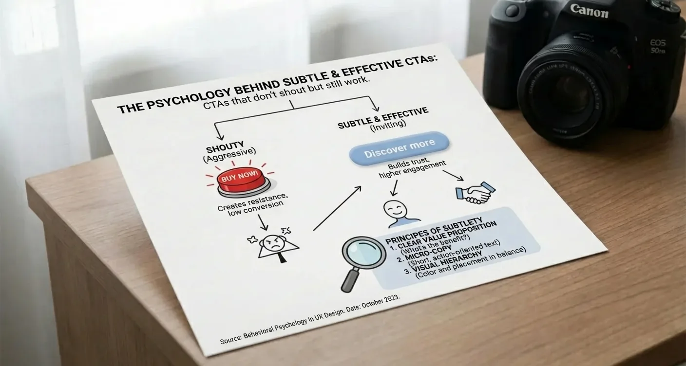
The Psychology Behind Subtle and Effective Buttons
When we think about conversion optimization, many designers lean towards bright colors and enormous fonts to grab attention. However, modern internet users have developed a strong intuition for intrusive marketing, often leading to 'banner blindness.' The true power of CTAs that guide, not shout, lies in understanding the visitor's cognitive load. Instead of a visual assault, a button should feel like the logical next step in a flowing conversation. This requires a balance between contrast and harmony, where the user doesn't feel pushed but rather invited to explore further in a natural way.
Subtle buttons significantly lower the barrier to interaction by removing psychological pressure from potential customers.
The Role of Visual Hierarchy and Calmness
Effective design utilizes whitespace and color theory to create focus without creating noise. If everything on a page screams for attention, ultimately nothing gets the attention it deserves. By opting for subtle CTAs that convert within a minimalist design, you provide the visitor's eyes with the necessary calm. This ensures the action button stands out due to its isolation and clarity, rather than its saturation. It's about creating a visual path that effortlessly guides the user to the ultimate goal, with the button acting as a friendly signpost in a familiar environment.
The use of soft shadows and rounded corners can make a button feel tangible without appearing aggressive within the layout.
"The best website interactions are those where the user doesn't have to think about where to click; it simply feels like the only right path."
Beyond the visual aspect, the textual content plays a crucial role in CTAs that guide, not shout. Words like 'now' or 'buy' can sometimes come across as too coercive, whereas terms like 'discover' or 'learn more' evoke a sense of freedom and curiosity. It's essential to tailor the language to the stage of the customer journey the visitor is in. For more information on how to strategically deploy content, you can check out our WordPress blog tips. By finding the right tone, you build trust instead of resistance, ultimately leading to higher-quality conversions and a better long-term user experience.
Why Less is Often More for Conversion
In practice, we see that an overload of choices often leads to decision paralysis, causing visitors to leave the website without taking any action. The principle of subtle CTAs that convert for conversion optimization is based on limiting distractions. When a button seamlessly integrates with the brand identity, the click feels less like a transaction and more like a personal choice. According to the principles of usability heuristics, an interface should always keep the user in control. This strengthens the feeling of autonomy, which is essential for a positive brand experience.
- Use complementary colors instead of clashing contrasts for mobile CTAs that guide, not shout.
- Focus on action-oriented verbs that promise value instead of suggesting an obligation.
- Ensure sufficient whitespace around the button to increase discoverability without forcing its size.
- Test various microcopy variations to see which tone resonates best with your specific target audience.
Implementing these psychological triggers ensures that CTAs that guide, not shout, become an integral part of your successful online strategy.
Focus on Value, Not Just a Hard Sell
The era of aggressive sales tactics and shouty buttons forcing users into hasty decisions is definitively behind us. In today's digital market, everything revolves around building trust and offering clear added value before any transaction occurs. Visitors have become more critical and can spot a standard sales pitch from a mile away. That's why it's essential to focus on CTAs that guide, not shout, by emphasizing what the customer gains from an interaction. Instead of a cold command, you invite the visitor to a logical next step in their customer journey, where their needs are central, not your sales objectives.
A subtle approach often results in higher-quality leads and an improved user experience on your platform.
When you examine the psychology behind conversion, you'll see that people are more inclined to click when they perceive a direct benefit. This means your buttons and links should textually align with the solution you offer. An effective strategy for CTAs that guide, not shout, is to replace generic terms like 'Submit' or 'Click here' with action-oriented phrases that underscore the promise of your services. For example, consider texts such as 'Unlock Your Growth Potential' or 'Start Saving Now.' By shifting the focus to the outcome for the user, you significantly lower the barrier to interaction. The goal is for visitors to feel understood and in control of the process, without being pushed by aggressive marketing language.
The Psychology of Gentle Conversion
Implementing subtle CTAs that convert for conversion optimization requires a deep understanding of your target audience and their specific pain points. In practice, we see that a gentle approach often performs better than a hard confrontation, especially for complex services or products with longer decision-making cycles. Therefore, it's advisable to offer different layers of interaction on your website.
"True persuasion lies not in the volume of the message, but in the relevance of the solution offered to the end-user."
To ensure this relevance, you can utilize the following elements in your design:
- Use contrasting colors that stand out without fatiguing the eyes.
- Place the text near valuable content or testimonials.
- Offer a free tool or knowledge document as a first step.
- Clearly communicate what happens after the click to remove uncertainty.
A well-thought-out WordPress website design plays a crucial role here, as visual hierarchy determines where the visitor's attention goes. If the page structure is logically built, CTAs that guide, not shout, flow naturally from the text. This creates a harmonious experience where commercial intent goes hand-in-hand with providing information. According to insights from Nielsen Norman Group, the readability and context of a link are decisive for a user's willingness to take action. By strengthening the context, you transform each button into a valuable signpost rather than an annoying interruption to the reading experience.
Ultimately, CTAs that guide, not shout, are about creating a win-win situation for both the owner and the visitor.
Design Principles for a Calm Yet Powerful Appearance
Creating visual balance in digital design requires a deep understanding of how colors, whitespace, and typography work together to guide the user without overwhelming them. In a world filled with flashy banners and aggressive pop-ups, more and more brands are opting for a minimalist approach that radiates calm. This doesn't mean website effectiveness decreases; on the contrary, by eliminating noise, the most important elements stand out more. Strategically deploying CTAs that guide, not shout, ensures that visitors feel respected in their decision-making process, which significantly strengthens long-term brand loyalty. A calm design invites exploration and considerably lowers the user's cognitive load, which is essential for a modern web experience.
When we look at the psychology behind conversion, we see that subtle signals are often more powerful than bright colors. By utilizing soft contrasts and clear hierarchy, you naturally guide the visitor's eyes towards the desired action. Implementing CTAs that guide, not shout, within a minimalist design is crucial here. The goal is for the button or link to feel logical within the page's context, thereby lowering the threshold to click without any visual coercion or irritation for the end-user. This creates a fluid interaction that the user perceives as pleasant.
Whitespace isn't empty space; it's an active design element that provides structure and breathing room for your website's content. By maintaining sufficient distance between text blocks and interactive elements, CTAs that guide, not shout, receive the attention they deserve without having to compete with other busy images. A well-thought-out color palette, based on complementary hues, can help convey a sense of authority and reliability. For those seeking professional support in setting up such an environment, our WordPress services are an excellent starting point for creating a balanced online presence that achieves results. Consistency in fonts and iconography contributes to a professional appearance that instills calm and trust in every visitor.
To maintain a powerful appearance, it's important to critically examine every element on the page. Ask yourself if a specific visual component truly adds value to the user experience or merely causes distraction. The use of CTAs that guide, not shout, for conversion optimization requires a refined approach where text and design go hand-in-hand. According to the guidelines of the Nielsen Norman Group, the visibility of system status and alignment with the real world are crucial for good usability. This means buttons should be recognizable as interactive, but not at the expense of the overall aesthetic calm of the platform. A well-designed interface is, after all, the key to success.
Ultimately, a powerful appearance stems from confidence in design; you don't need to shout if your message and offering are clear. By opting for CTAs that guide, not shout, within your brand identity, you build a lasting relationship with your audience. A calm design exudes professionalism and shows that you value your visitor's time, which in today's digital economy is one of the most precious assets you can nurture. By consistently applying these principles, you transform your website from a simple information channel into a powerful instrument for growth and customer satisfaction, always keeping the user at the center of the process.
Contextual Relevance: The Right Message at the Right Time
The effectiveness of a modern website stands or falls with how visitors are guided through their unique customer journey. Simply placing a brightly colored button is no longer enough to persuade today's critical consumer. Instead, everything revolves around contextual relevance, where the message seamlessly aligns with the reader's specific information needs at that exact moment. By offering subtle guidance instead of aggressive sales tactics, you create a digital environment where the user truly feels understood. This is where CTAs that guide, not shout, prove their true value; they follow the natural flow of the reading process without being disruptive or coercive to the visitor.
A strong conversion strategy feels like a logical continuation of the provided content, not an annoying interruption to the user experience. When a visitor is still in the orientation phase, a hard-sell text often deters them. The secret lies in offering value that matches the user's current mindset. This means that on an informative page, you'd opt for an invitation to delve deeper rather than a direct purchase obligation. Implementing this tactic in a business context builds a higher level of trust and authority. According to consumer behavior research, users react more positively to links that provide clarity about the next step in their process.
To put this into practice, consider the following elements for your strategy:
- Use action-oriented language that focuses on the direct benefit for the visitor.
- Ensure visual contrast that stands out without disturbing the design's aesthetics.
- Place the text at natural breakpoints within the written content.
- Test various versions to see what resonates best with your target audience.
Optimizing these interaction moments requires a deep understanding of web design and technology. For those needing help with technical implementation, a specialist is essential to find the right balance between speed and functionality. The goal, after all, is for interactions on mobile devices to be just as effective as on a desktop. By continuously testing and refining, you ensure that every interaction contributes to the website's ultimate goal, while the visitor retains control.
Measuring and Optimizing Your Subtle Conversion Paths
Analyzing user behavior is essential to understand how visitors respond to an understated approach. Instead of focusing on aggressive pop-ups, we examine the effectiveness of CTAs that guide, not shout, within the natural reading flow. Through heatmaps and click-path analyses, you can discover whether your audience picks up on subtle hints or needs more guidance. The goal is to find a balance where the user feels supported rather than rushed during the navigation process on your platform.
Successful conversion hinges on trust and relevance, often resulting in CTAs that guide, not shout, attracting a high-quality audience.
Data-Driven Refinement of Your Strategy
When you start optimizing your website, it's advisable to test various micro-copy variants. A small change in phrasing can determine whether a visitor clicks through to a custom webshop or leaves the page. Use qualitative customer feedback to discover which words resonate. In practice, a gentle invitation is often accepted more frequently than a coercive command, provided the page's context seamlessly aligns with the visitor's needs at that specific moment.
"The power of effective conversion lies not in the volume of the message, but in the timing and sincerity of the offer to the end-user."
Monitoring conversion optimization with CTAs that guide, not shout helps you deploy your marketing budget more effectively for sustained growth.
Practical Steps for Analysis
- Evaluate the click-through rate of text links versus prominent buttons.
- Check bounce rates on pages featuring CTAs that guide, not shout.
- Compare results with the experiences of others on our testimonials page.
- Adjust color contrasts to enhance readability without creating visual clutter.
Ultimately, it's about creating a harmonious user experience. By maintaining consistency in your communication and utilizing Google Keyword Planner for relevant terms, you build a position of authority. Implementing CTAs that guide, not shout, ensures your brand comes across as professional and reliable to your target audience.
Continue experimenting with the placement of your CTAs that guide, not shout, for optimal results.
Effective conversion is all about subtlety and psychology. By focusing on value rather than volume, you create a natural clicking experience for visitors. Implementing CTAs that guide, not shout, ensures a professional appearance that directly strengthens customer trust. The secret to successful conversion optimization lies in understanding your target audience's intent. When texts align with reader needs, the necessity for aggressive sales tactics disappears entirely.
Use soft colors, relevant microcopy, and logical placement to effortlessly guide users through the funnel without causing irritation. Do you also want a website that converts without being pushy? Start testing these refined strategies today. Discover how small adjustments in buttons and texts lead to significantly higher returns and a loyal customer base that truly feels understood by your unique brand.
Frequently Asked Questions
What are CTAs that guide, not shout?
These are subtle calls to action that focus on value and relevance instead of aggressive sales language. By addressing the reader's needs, these CTAs that guide, not shout, create a natural transition to the next step in the customer journey.
How do you write an effective but understated call to action?
Focus on user benefits and use action-oriented verbs that feel less coercive, such as 'Discover more' or 'Explore options.' The secret to CTAs that guide, not shout, lies in offering help instead of demanding a click.
Why are subtle buttons sometimes more effective than bright colors?
Overly conspicuous buttons can lead to 'banner blindness' or irritation for the visitor, which actually lowers conversion. A design that harmonizes with the rest of the page instills more trust and appears more professional to a discerning audience.
When is the best time to use a gentle CTA?
Gentle CTAs are ideal for the early stages of the sales funnel, such as with informative blog posts or whitepapers. At these moments, the reader wants to be informed first before they are ready for a direct purchase decision.
How SEO Supercharged helps you here
SEO Supercharged is fully online (service area: in the cloud), so you can use it from anywhere.
The platform is built for Independent copywriters and content creators, SME business owners with their own webshop, Digital marketing agencies in Flanders, SEO specialists and consultants, Marketing managers at Belgian scale-ups, Bloggers and affiliate marketers, Startup founders in the tech sector, E-commerce managers of large retail chains, Communication officers at local governments.
You can use it for, among other things, AI SEO tooling audit, Implementation of AI content workflows, Strategic selection of the best AI SEO generator, Prompt engineering for Belgian SEO copy, Automation of SEO metadata via AI, Quality control for AI-generated texts, AI SEO workshop for marketing teams.
Want to tackle this directly? Build your brand with the Branding generator, or start a free SEO analysis.
Related articles
- Branding for Conversion: How Your Brand Boosts SEO and Revenue
Unlock how branding supercharges your SEO and AI visibility, driving higher CTR, trust, recognition, and topical authority. Get practical tips, templates.
- Case Study: Implementing the 'Corporate Trust' Style Without Clutter
Explore our 'Corporate Trust' style guide. Learn to implement a professional, clutter-free design that builds authority and trust. Get practical tips for.
- Brand Kit Essentials: Logo, Colors, Icons, and Application
Unlock the power of brand kit essentials: logo, colors, icons, and their application. Build a strong, consistent brand identity with our comprehensive guide!
- Visual Consistency on Your Website: The Key to Building Trust and Credibility
Boost brand recognition and conversions with consistent web design. Learn how a cohesive visual identity builds user trust and professionalism. Read our guide!
- Service Page Hero Sections: 5 Proven Layouts
Discover the best service page hero sections: 5 proven layouts to boost conversions. Optimize your website and attract more clients now!