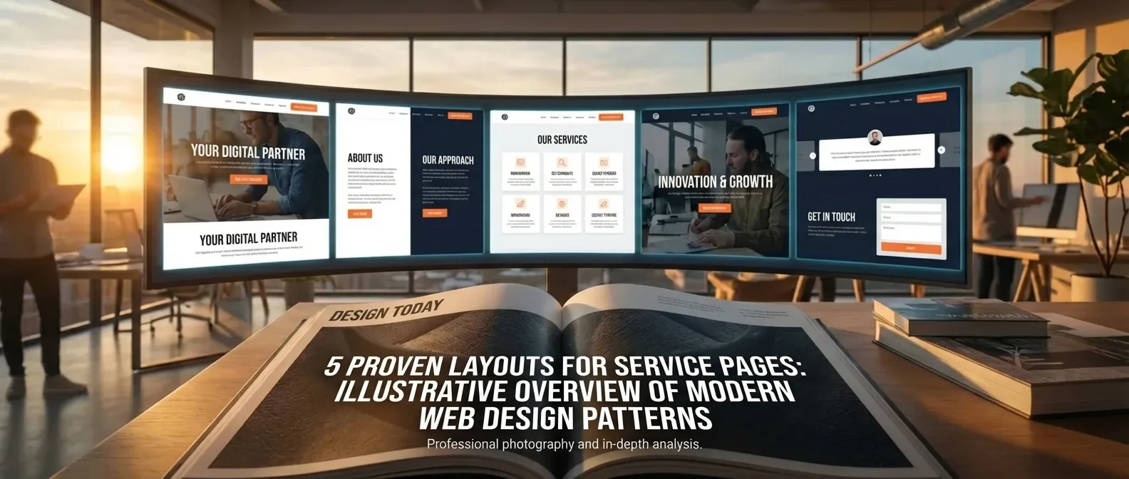
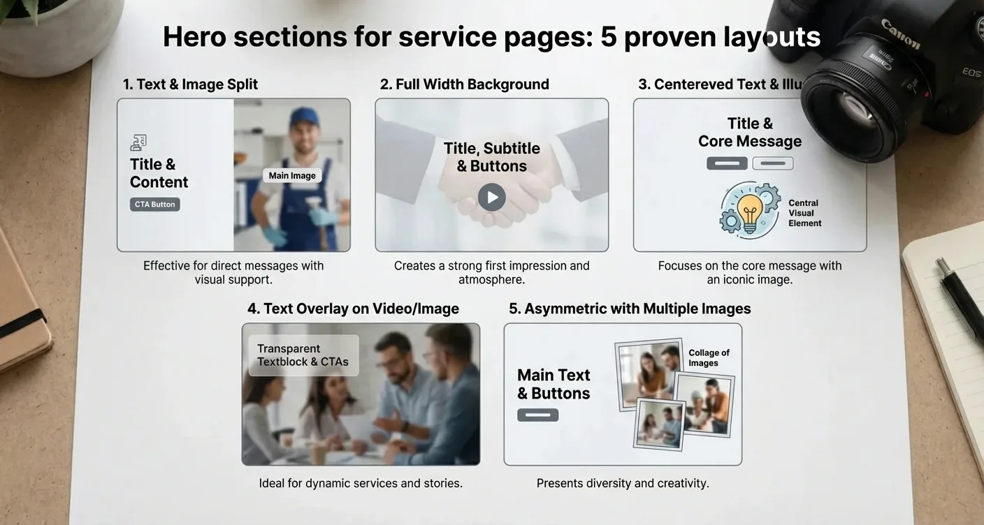
Service Page Hero Sections: 5 Proven Layouts
Service Page Hero: 5 Proven Layouts for Conversions
A well-designed Service Page Hero section, specifically exploring 5 proven layouts, forms the foundation of a high-converting website by immediately presenting the right message and visual hierarchy. Optimizing these elements ensures potential customers instantly grasp the value you offer. This is crucial for a low bounce rate and a professional appearance for your business services.
Hero sections for service pages: 5 proven layouts form the foundation of a high-converting website by immediately presenting the right message and visual hierarchy. Optimizing these elements ensures potential customers instantly grasp the value you offer. This is crucial for a low bounce rate and a professional appearance for your business services.
An effective strategy combines powerful headlines with visual clarity. Implementing optimal hero sections requires a precise balance between textual relevance and aesthetics. When you consistently apply these proven patterns, it significantly strengthens your brand's authority. Good designs naturally guide users to the next step in their customer journey, which boosts conversion rates.
By focusing on user-friendliness and clear calls-to-action, you transform static pages into dynamic lead generators that deliver results for your business.

What Makes a Hero Section Effective for Conversions?
A website's first impression is formed within milliseconds, and the hero section plays the absolute leading role in this. It's the first thing a visitor sees without scrolling, often called 'above the fold.' An effective hero section must immediately communicate what you offer, what problem you solve, and what action the visitor should take. When we examine Hero sections for service pages: 5 proven layouts, we see that the balance between visual appeal and functional text is crucial for reducing the bounce rate. A strong headline combined with a clear value proposition ensures the user feels immediately understood. It's not just about a pretty picture; it's about creating a psychological path that leads to trust and action. In practice, a cluttered or unclear top section of the page often drives potential customers directly to competitors.
Hero sections for service pages: 5 proven layouts form the foundation of a high-converting landing page that delivers results.
The Psychology Behind Visual Hierarchy
Visual hierarchy dictates where a visitor's eyes go first. By using contrast, font size, and white space, you can direct attention to the most important elements of your offering. Implementing Hero sections for service pages: 5 proven layouts for businesses helps structure this information in a way that feels natural to the user. A powerful image or video showing the service in action can increase emotional engagement, while the text provides the rational justification. It's crucial that the Call-to-Action (CTA) stands out by using a contrasting color not predominantly present elsewhere in the hero section. According to user experience experts at Nielsen Norman Group, users often scan pages in an F-pattern or Z-pattern, which influences the placement of your logo and key message.
Using optimal Hero sections for service pages: 5 proven layouts for higher conversions is a proven method for success.
Beyond the visual elements, the textual content is invaluable for both users and search engines. A good hero section includes a relevant H1 tag that directly aligns with the visitor's search intent. By focusing on Hero sections for service pages: 5 proven layout strategies, you ensure the page is not only aesthetically pleasing but also technically optimized for discoverability. Combining strong copywriting with affordable search engine optimization creates a synergy that attracts more quality traffic to your service pages. Don't forget that the loading speed of this section is crucial; a slow hero image can negatively impact the user experience before the visitor has even read a word.
"A hero section is not a decoration, but a functional tool that must convince the visitor of the added value of your services within three seconds."
Essential Components for Success
- A clear, concise headline that states the primary value of the service.
- A supporting subhead that delves deeper into the benefits for the customer.
- A primary Call-to-Action that prompts a specific next step.
- Social proof, such as a brief customer review or logos of well-known partners.
- Visual support that immediately clarifies the service's context.
When you opt for Hero sections for service pages: 5 proven layouts implementation, you invest in the growth of your online authority.
It's important to remember that Hero sections for service pages: 5 proven layouts are not static elements; they must be regularly tested and adjusted based on user data. By A/B testing different headlines or images, you'll discover what best resonates with your specific target audience. Effective Hero sections for service pages: 5 proven layouts make the difference between a visitor who stays and one who leaves.
The Power of Hero Sections for Service Pages: 5 Proven Layouts
A website visitor's first impression is formed within milliseconds, and nowhere is this more crucial than on a page where you offer your services. A strong visual opening determines whether a potential customer keeps scrolling or immediately returns to the search results. When we look at Hero sections for service pages: 5 proven layouts, we see that the balance between aesthetics and functionality is decisive. It's not just about a beautiful image; it's about immediately communicating value, authority, and the solution to the user's problem. By strategically using white space, typography, and color contrast, you can directly guide the visitor's attention to your most important message.
An effective hero section serves as your business's digital handshake and must immediately inspire trust in your target audience.
The Psychology Behind Conversion-Focused Layouts
Understanding user intent is essential when implementing Hero sections for service pages: 5 proven layouts. Visitors landing on a service page are often looking for a specific solution or expertise. For example, a layout with central text alignment works excellently for minimalist brands that want to convey a sense of calm, while a split-screen design is ideal for presenting text and visuals equally. The use of optimal Hero sections for service pages: 5 proven layouts for conversion optimization helps structure this information. According to research on eye-tracking patterns, users often follow an F-pattern or Z-pattern, meaning the most important information should be placed in the top left or center to generate maximum impact without overwhelming the visitor with too many stimuli simultaneously.
To further optimize your website for search engines, you can consult these WordPress SEO tips to rank higher on Google for technical improvements.
A good structure contains the following elements:
- A powerful H1 headline that addresses the main problem.
- A supporting subhead that clarifies the unique selling propositions (USPs).
- A clear Call-to-Action (CTA) that encourages direct interaction.
- Visual evidence, such as a high-quality photo or a short video background.
"The hero section is not the place for subtlety; it's where your promise to the customer must be crystal clear."
Why Design Variation Makes a Difference
Not every service requires the same approach; a law firm needs a different look than a creative marketing agency. Within the concept of applying Hero sections for service pages: 5 proven layouts, it's essential to align the visual style with the industry. An asymmetrical layout can suggest innovation, while a classic centered arrangement conveys stability and tradition. It's advisable to observe how market leaders design their Hero sections for service pages: 5 proven layouts to gain inspiration for your own unique proposition. For more in-depth information on web design trends, you can visit the website of Nielsen Norman Group, an authority in user experience.
Consistently testing different Hero sections for service pages: 5 proven layout variations ensures you discover what best resonates with your specific audience.
By investing in a well-thought-out Hero sections for service pages: 5 proven layout strategy, you lay a solid foundation for the rest of the customer journey on your website. A strong visual start significantly reduces the bounce rate and increases the likelihood that visitors will actually make contact or request a quote. It's an investment in time and design well worth it, as it directly contributes to the professional appearance and credibility of your online presence in a competitive market.
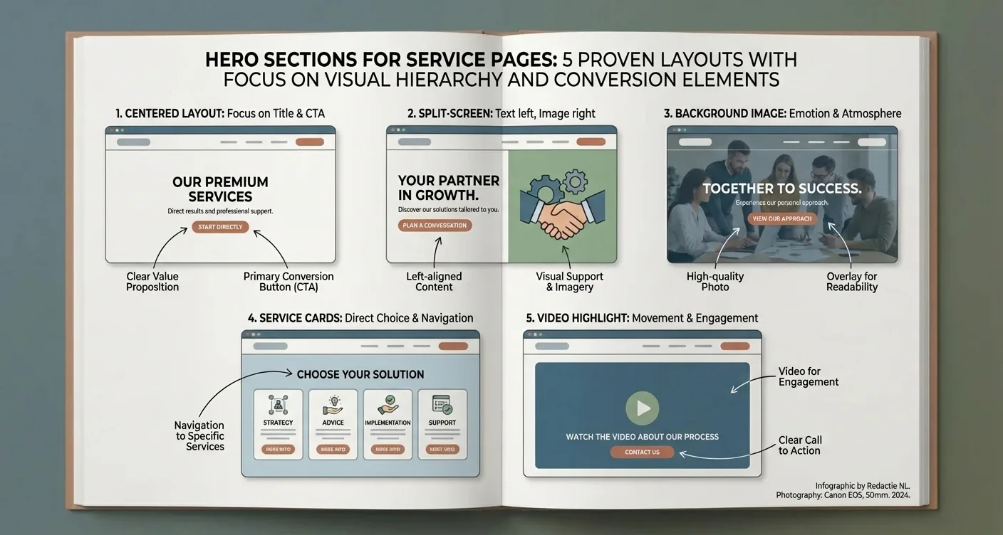
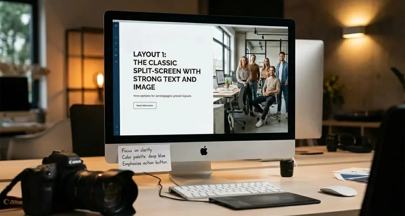
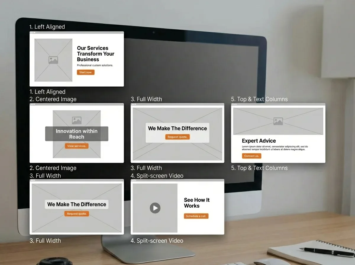
Layout 1: The Classic Split-Screen with Strong Text and Visuals
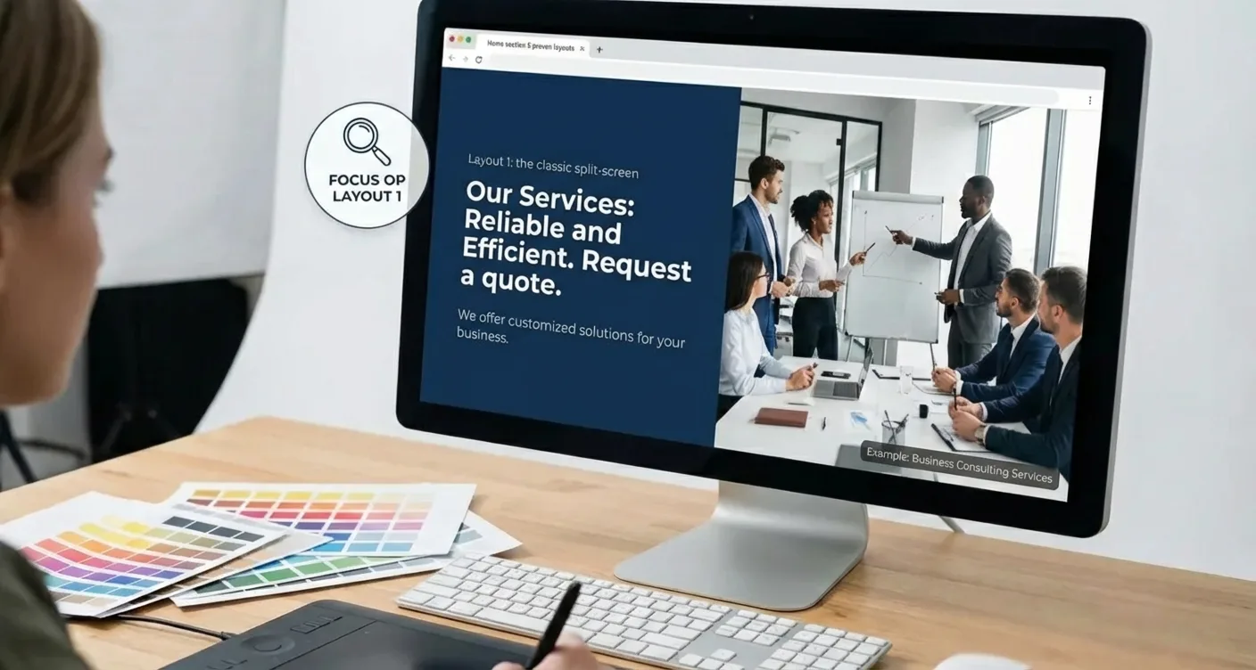
The split-screen layout is a timeless favorite in web design, and for good reason. In this specific setup, the screen is vertically divided into two equal or nearly equal parts, with the textual message on one side and a supporting visual element on the other. When we examine Hero sections for service pages: 5 proven layouts, this variant often tops the list due to its perfect balance between information delivery and aesthetics. It offers a direct, clear structure that doesn't overwhelm the visitor but rather guides them step-by-step through the value proposition. By placing the text on the left, you align with the natural reading direction of Western users, which significantly streamlines information processing.
This layout works excellently because it distributes attention without distracting. The visitor immediately sees the core of the service offering while the image reinforces the emotional context.
The Power of Visual Hierarchy and White Space
Within the context of Hero sections for service pages: 5 proven layouts, the split-screen method is extremely effective for creating a clear visual hierarchy. The left side usually serves as the anchor point for the H1 headline, a short descriptive paragraph, and a prominent call-to-action button. The right side often features a high-quality photo of the service in action or an abstract illustration that embodies the brand's atmosphere. The use of sufficient white space around the text elements allows the message to breathe, which in practice often positively influences the conversion rate. It's a safe yet powerful choice for businesses that want to convey professionalism and reliability to their potential customers.
To optimally utilize this layout, it's essential that the image and text complement each other rather than compete. A cluttered photo can distract from the main textual message.
When implementing Hero sections for service pages: 5 proven layout strategies, it's wise to consider the following technical and content-related aspects for optimal results:
- Ensure a high-contrast background color that keeps the text readable.
- Use images of real people to build human connection and trust.
- Optimize images for speed without sacrificing visual sharpness.
- Place the primary call-to-action directly below the introductory text for maximum visibility.
"A good split-screen hero section tells the story of the service at a glance, with visuals and text working as an inseparable duo to persuade the visitor."
It's crucial to remember that the mobile view of these Hero sections for service pages: 5 proven layout examples often requires a 'stacking' method, where elements are placed one below the other. For more information on how this is technically handled, you can look at WordPress website design. Good preparation for mobile users is essential, as the split-screen must be prioritized differently on small screens to ensure readability. Implementing Hero sections for service pages: 5 proven layouts for conversion optimization therefore requires an eye for both desktop and mobile. For in-depth guidelines on web standards, you can consult the documentation of the W3C. By adhering to the principles of the Hero sections for service pages: 5 proven layout method, you lay a solid foundation for any service page that is both visually appealing and functional.
Layout 2: The Centered Approach for Maximum Focus
When we look at the effectiveness of Hero sections for service pages: 5 proven layouts, the centered variant immediately stands out due to its simplicity and visual power. In this specific configuration, the headline, supporting text, and call-to-action button are all placed in the center of the screen, often on top of a calm background or a subtle image. This symmetry creates an immediate focal point for the visitor, as their eyes don't have to wander across the screen to find the main message. It's a minimalist approach that works excellently for businesses aiming to convey a sense of authority, calm, and professionalism to their potential customers.
The centered layout forces the designer to make choices and present only the most essential information to the user.
The Psychology Behind Centered Content
In the world of web design, it's all about guiding attention, and when it comes to Hero sections for service pages: 5 proven layouts, the centered option is the king of focus. By strategically using white space on the sides, you create a natural frame that highlights the text in the middle. This type of design is often associated with luxury brands or specialized services where the quality of the offering speaks for itself. It minimizes distractions, making visitors more likely to actually read the text instead of just scanning the page for visual stimuli.
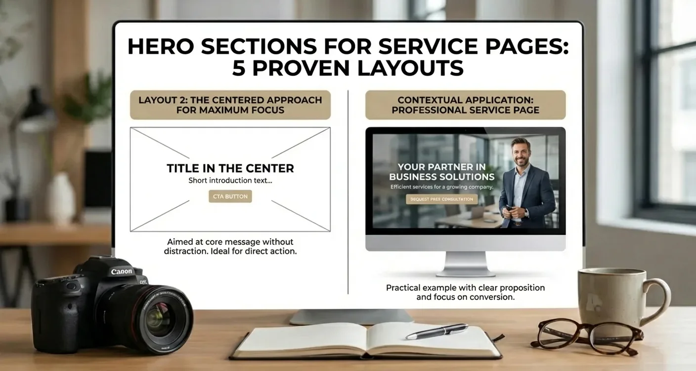
Within the framework of Hero sections for service pages: 5 proven layouts, it's essential to understand when this specific style is most effective. While an asymmetrical layout offers dynamism, the centered approach provides a stable foundation for services that require trust, such as legal advice or medical consultations. Using a powerful, concise headline is crucial here to maximize impact. For those who need help with the technical implementation, our WordPress services offer the necessary support to make these layouts perfectly responsive for any device.
When to Choose This Layout?
Not every service lends itself to a centered design, but within the guide on Hero sections for service pages: 5 proven layouts, this is the most versatile choice for mobile users. Because mobile screens are narrow, almost all layouts eventually become centered; by using this as the basis for your desktop version, you maintain a consistent brand experience across all platforms. The best Hero sections for service pages: 5 proven layouts strategy for mobile often starts with this centered foundation. It is especially effective when you want one clear action for the visitor to take, without them being distracted by secondary information in the sidelines.
"A centered design isn't simply about putting text in the middle; it's about creating a visual hierarchy that guides the user directly to the core of your service offering."
- Use a background image with a low contrast value to ensure text readability.
- Provide sufficient white space above and below the text elements to allow the section to 'breathe.'
- Limit the width of text lines so the visitor doesn't have to scan with their eyes from left to right.
- Place the primary call-to-action directly below the descriptive text for a logical flow.
The success of Hero sections for service pages: 5 proven layouts implementation often depends on the typography you choose. A large, bold font works best in a centered arrangement because it reinforces the authority of the message. According to design principles on Nielsen Norman Group, a clear visual hierarchy helps users quickly understand what a page offers. By applying these principles to your Hero sections for service pages: 5 proven layout design, you increase the likelihood that visitors will stay longer on your site and ultimately take action.
Don't forget that the centered layout can also be perfectly combined with a clear navigation structure at the top of the page.
Layout 3: Integrating Social Proof in Your Top Section
Trust is the cornerstone of any successful business relationship, especially when a visitor lands on your website for the first time. In the guide to Hero sections for service pages: 5 proven layouts, we see that immediately showcasing authority significantly lowers the barrier to contact. By placing elements such as star ratings, logos of well-known clients, or a short testimonial directly below your main text, you immediately confirm your expertise. Visitors unconsciously seek confirmation from others before deciding to engage with an unknown party.
The Power of Immediate Validation
When you opt for Hero sections for service pages: 5 proven layouts with social proof, you create a psychological advantage over competitors who hide their testimonials at the bottom of the page.
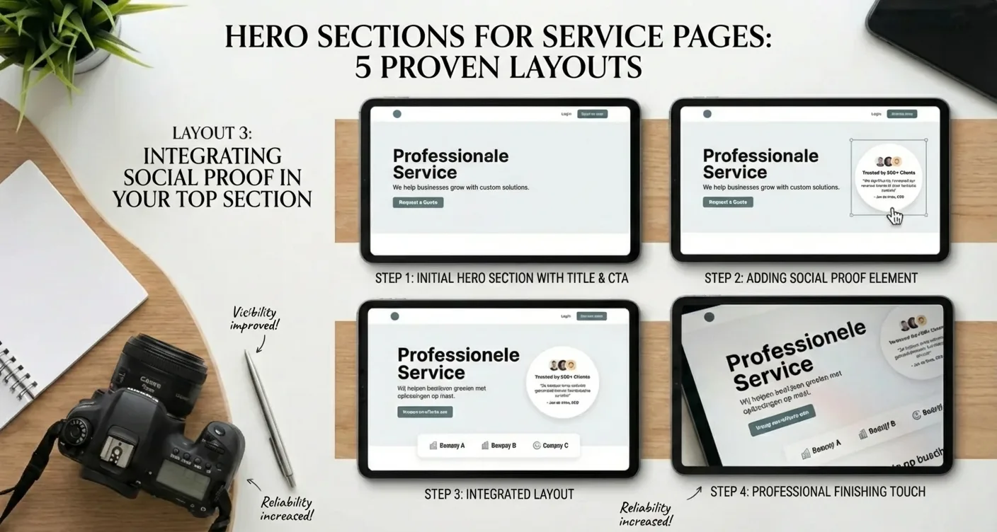
Implementing this specific layout requires a delicate balance between your own message and the voice of your clients. It's essential that the social proof doesn't completely distract from your primary call-to-action but rather supports it. An effective method is to place a subtle bar with partner logos or a compact Google Reviews widget directly above or below the main button. This ensures the visitor continues reading with peace of mind, knowing that others have had positive experiences with your services. For optimal technical implementation, you can look at our WordPress services to seamlessly integrate these elements. This is about the best Hero sections for service pages: 5 proven layouts strategy where credibility is central.
"Social proof in the hero section transforms a simple landing page into a reliable digital business card that delivers immediate results."
Essential Elements for Layout 3
- A powerful headline that emphasizes the core value of your service.
- Visual indicators of quality, such as stars or quality marks.
- Logos of reputable companies you've previously worked for.
- A clear link to an extensive portfolio or case studies.
Using Hero sections for service pages: 5 proven layouts for maximum conversion helps build a brand identity that exudes authority. According to consumer psychology research by Nielsen Norman Group, users trust visual cues from third parties faster than self-promotion. By applying these principles within the Hero sections for service pages: 5 proven layout methodology, you significantly strengthen the impact of your first impression.
Ultimately, it's about reassuring the visitor of their choice to click on your link.
Essential Elements for a Converting Service Page Hero
Designing an effective top section of your website requires a strategic approach where visual hierarchy and textual persuasive power converge. When we look at Hero sections for service pages: 5 proven layouts, it's clear that the most successful examples always combine a clear value proposition with a direct call-to-action. Visitors decide within seconds whether they will stay on your page, making the first impression of your services crucial for reducing the bounce rate and increasing long-term engagement.
The Psychology Behind Visual Hierarchy
A strong visual focus directs the user's eyes immediately to the most important information and the desired next step within your conversion path.
To maximize the impact of Hero sections for service pages: 5 proven layouts, certain components must seamlessly align. A high-quality image that supports your services often works better than generic stock photos. Additionally, the headline must directly answer the customer's question. For those looking to go a step further in e-commerce, a custom e-commerce solution provides the ideal structure to present complex services or products directly from the hero section to the target audience.
"The hero section is not merely a visual element, but the digital handshake that sets the tone for the entire customer journey and immediately confirms your brand's credibility."
Indispensable Components for Success
When implementing Hero sections for service pages: 5 proven layout tips for conversion, it's essential to integrate social proof. This can be done through star ratings or short testimonials from satisfied customers placed directly below the main button. According to guidelines from Nielsen Norman Group, these visual elements should support the content and not distract from the core message. Therefore, use Hero sections for service pages: 5 proven layouts for maximum impact to establish your authority in the market.
- A powerful H1 headline that addresses the biggest customer problem.
- A supporting subhead that briefly explains the unique solution.
- Primary and secondary buttons for different stages in the customer journey.
- Visual elements that build trust, such as partner logos.
Choosing the right Hero sections for service pages: 5 proven layout strategy depends on your specific business goals and target audience interaction.
The right first impression is crucial for conversion.
By choosing one of these hero sections for service pages: 5 proven layouts, you immediately increase the likelihood that visitors will take action. A strong visual hierarchy and clear headlines are essential for success.
Optimizing the top of your page doesn't have to be complicated if you focus on your target audience's needs. Experiment with various elements such as powerful images, clear call-to-action buttons, and social proof to discover what works best for your specific services. Do you want to get started immediately with improving your online results and creating a professional appearance that inspires trust in every new visitor? Contact our specialists today for a no-obligation consultation about your web design and discover how we can elevate your conversions.
Frequently Asked Questions About Your Service Page Hero
What is the primary goal of a Service Page Hero?
The primary goal of a Service Page Hero is to immediately grab a visitor's attention, communicate your core value proposition, and guide them towards the next conversion step, all without them having to scroll.
How do I choose the best layout for my Service Page Hero?
Choosing the best layout for your Service Page Hero depends on your brand's style, the complexity of your service, and your target audience's preferences. A/B testing different layouts is crucial to determine what performs best for your specific business goals.
Should a Service Page Hero always include a Call-to-Action?
Yes, a compelling Call-to-Action (CTA) is an essential component of an effective Service Page Hero. It provides clear guidance for the visitor, encouraging them to take the desired next step, whether it's "Learn More," "Get a Quote," or "Contact Us."
What is the main goal of hero sections for service pages: 5 proven layouts?
The primary goal is to immediately capture the visitor's attention and clearly communicate your service's value proposition. By utilizing hero sections for service pages: 5 proven layouts, you increase the likelihood that a visitor will stay on the page and take action.
How do I choose the right layout for my specific services?
The choice depends on your target audience and the type of service you offer; a visual layout works well for creative services, while a text-focused layout is better for business consulting services. In the guide on hero sections for service pages: 5 proven layouts, you'll find specific examples that suit various industries.
Why is a strong Call-to-Action (CTA) essential in the hero section?
A CTA directs the visitor immediately to the next step in the conversion process, such as requesting a quote or making an appointment. Without a clear button, you lose potential customers who are interested but don't know what to do next.
When should I revise or adjust my current hero section?
It's advisable to revise your layout when you notice a high bounce rate on your service page or when conversions are lagging. By regularly testing different proven designs, you can continuously optimize the user experience and your results.
How SEO Supercharged helps you here
SEO Supercharged is fully online (service area: in the cloud), so you can use it from anywhere.
The platform is built for Freelance copywriters and content creators, SME business owners with their own webshop, Digital marketing agencies in Flanders, SEO specialists and consultants, Marketing managers at Belgian scale-ups, Bloggers and affiliate marketers, Startup founders in the tech sector, E-commerce managers of large retail chains, Communication managers at local governments.
You can use it for, among other things, AI SEO tooling audit, Implementation of AI content workflows, Strategic selection of the best AI SEO generator, Prompt engineering for Belgian SEO copy, Automation of SEO metadata via AI, Quality control for AI-generated texts, AI SEO workshop for marketing teams.
Want to tackle this directly? Build your brand with the Branding generator, or start a free SEO analysis.
Related articles
- Branding for Conversion: How Your Brand Boosts SEO and Revenue
Unlock how branding supercharges your SEO and AI visibility, driving higher CTR, trust, recognition, and topical authority. Get practical tips, templates.
- Case Study: Implementing the 'Corporate Trust' Style Without Clutter
Explore our 'Corporate Trust' style guide. Learn to implement a professional, clutter-free design that builds authority and trust. Get practical tips for.
- Guide, Don't Shout: Crafting Effective, Subtle CTAs
Discover how subtle CTAs boost conversions without being pushy. Read our expert guide to optimize your website, enhance user experience, and achieve better.
- Brand Kit Essentials: Logo, Colors, Icons, and Application
Unlock the power of brand kit essentials: logo, colors, icons, and their application. Build a strong, consistent brand identity with our comprehensive guide!
- Visual Consistency on Your Website: The Key to Building Trust and Credibility
Boost brand recognition and conversions with consistent web design. Learn how a cohesive visual identity builds user trust and professionalism. Read our guide!